CMF
(Color, Material & Finish Design)


Truck drivers spend days and even months in their trucks, therefore, for product design, making them feel like “home away from home” is always a challenge in which colors play an important role. Gray is a timeless and versatile color that can be utilized in many different combinations. Often times greys can transmit a cold feeling so we were very careful to choose and work with grays on the warm side of the palette. It is important to make the interior feel inviting and cozy, but sporty and modern at the same time. Playing around with three shades of warm gray – light, medium, dark – in combination with black (also warm) and an orange accent, gave us the perfect palette to deliver the look & feel we were aiming for.
There are two key things to consider when applying colors to the interior of a truck. On one hand, we’ve got soiling, as these vehicles are used as working tools and the driver gets in and out pretty often, bringing a lot of dust and soil inside of the cab. Therefore, it’s important to wisely choose a color that is forgiving, especially on components that are in constant contact with the driver. We used the darker colors, Wren and Raven, on all components found under the waistline. On the other hand, it’s very important to create a sense of space. It’s crucial to make the space feel larger than what it really is. With that being said, we applied the lighter colors on everything that goes above the head. For upper cabinets, we used Longspur, medium grey; and for headliners and skylight bezel, we worked with the lighter one, Heron. It is amazing how colors can make you feel in a limited space.

_SAFETY is Volvo’s first and most important core value. The brand has been always known as one of the safest in the world. Did you know that Volvo invented the three-point seatbelt everyone has? Well, that’s where the Reflektor Orange comes into play. We developed a master color based on the iconic bright orange seatbelt. Used only as an accent on hard trim and textiles, the color brings life to the interior while highlighting safety awareness. The higher the trim level, the more presence of the accent you’ll get. The rear wall, for example, is offered in different textiles, most of them in Longspur grey with a shimmer accent, but for premium level, we developed a fabric with an orange thread accent woven in the pattern. We added orange stitching on seats. It’s all about the details.

In order to bring these neutrals to life, we added a shimmer effect on some of the textiles and leather. It helps reflect the light which tends to be scarce in the interior of the cab, especially in the living environment. It also accentuates the texture of the material and the overall shape of the component in which it is applied.


 |  |  |  |  |  |  |
|---|---|---|---|---|---|---|
 |  |  |  |  |  |  |
 |  |  |
This is the perfect combination of GRAPHIC and CMF design in one project. It’s one of my favorite creations so far, in this industry.
Inspired in a seat fabric already chosen for the project, I designed this pattern. The interesting thing is that every piece is different. They’re all based on one “direction pattern” that serves as base guidelines to create different versions, maintaining the same visual language, though allowing every piece to be unique.
The Migration pattern has been applied to several components in the interior of the truck, merchandise collection and marketing collateral. I worked hand in hand with suppliers and cross-functional teams to make sure the pattern was properly applied to every surface, piece, component, material, etc.
_PATTERN APPLICATIONS:
_ Floor mat inserts / carpets
_ IP storage tray mat
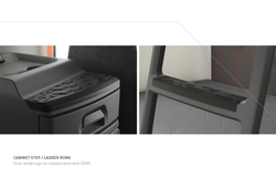
_ Ladder rungs
_ Cabinet step
_ e-quilted mattress cover
_ Instrument Cluster
_ Textiles
_ Marketing collateral
_ Merchandise collection